
The Intentional OrganizationA Leadership & Management Guide
Our book, up close
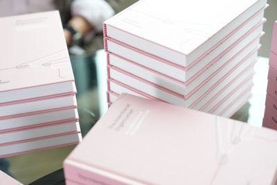
People often tell us that photos don’t really do our book justice, but here’s our attempt anyway. Take a closer look at the hardcover, including a few notes on the choices behind it.

We hear it constantly from people who get the book in their hands: it’s a genuinely beautiful object, and that surprises them. We put real care into the physical book, not just the words in it, so we wanted a place to show that off properly rather than squeeze it into a thumbnail.
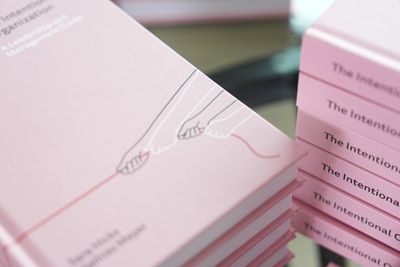
Cover & binding
A quiet cover, drawn in one line
We didn’t want a cover that shouted. It’s a casebound hardcover designed by Steve Leard in our signature dusty pink, with a single unbroken red line drawn across it by hand, the similar line that opens every chapter inside. It’s restrained on purpose, so it looks at home on a shelf next to the books that inspired us, not like it’s trying to sell you something.
This book is printed on Forest Stewardship Council® (FSC®) certified paper. We chose 90 grams per square meter stock for the interior pages. It was printed in Illinois, USA.
Our cover design is a visual representation of our book. There’s a saying in German, “an einem Strang ziehen,” which translates to “pulling together” or “acting in unison.” The black and white hands pulling together on the rope represents teamwork, diversity, and inclusion. The rope leads to our light bulb logo on the back cover which represents ideas, light, and clarity. Intentional organizations are built from inclusive and diverse teams who act together to gather ideas and find clarity.
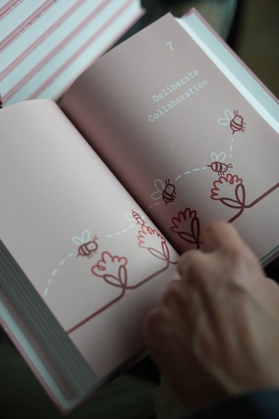
Illustration
One line, eleven chapters
Every chapter opens with its own illustration by Geri Coady, and every one of them is drawn as a single continuous line that never lifts off the page. It’s a small, deliberate thread running through the whole book, a visual echo of the idea that intentional organizations are built one continuous, connected decision at a time, not in isolated bursts.

Typography
The same type system, on paper
Inside, the book is set in Tisa Sans Pro and Neue Montreal Mono, the same pairing Simon Collison chose for this site. Montreal Mono carries the chapter numbers and structure; Tisa Sans Pro carries the long stretches of reading. Red runs through both as a functional color, not just a decorative one: it marks chapter numbers, rules, and the parts of the book you’ll want to find again quickly.

Built to be used
Frameworks you can find again
This isn’t a book meant to be read once and shelved. Every chapter includes frameworks and reflection questions, and we set them in red throughout so they’re easy to flip back to, whether you’re prepping for a hard conversation or just want to reread the guiding principles before a big decision. You can even download all of the Reflections, the Reading List, and Worksheets that are included throughout the book.
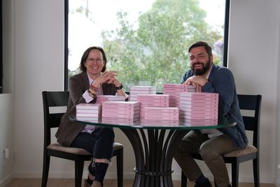
The process
The day the boxes arrived
We’d looked at cover proofs and page layouts on screens for months, but nothing quite prepared us for opening the boxes and finding a table full of finished, physical copies. That’s the moment this whole page is trying to bottle: the difference between seeing the book and holding it.
A few more photos
A handful of shots from our own copies.




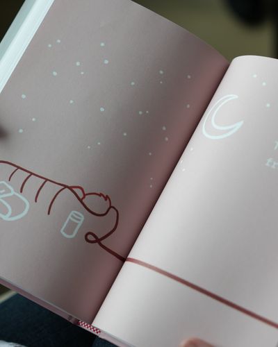




The compliment we hear most isn’t about a chapter. It’s “I can’t believe how beautiful this book is in person.” Sara & Mathias
Cover designed by Steve Leard. Chapter illustrations by Geri Coady. Book layout by Vivian Steckline, produced by Victoria Petelin. Set in Tisa Sans Pro and Neue Montreal Mono, the same typefaces Simon Collison chose for this site. Published by Wise Ink.
Ready to hold it yourself?

Read our newsletter
Sign up to learn more about our book and to receive podcast and journal updates.